
Project-1 MTH-522
Mth_522_Project_1
This is our group project
Team Members
Nikhil Premachandra rao
Prajwal Sreeram Vasanth Kumar
Chiruvanur Ramesh Babu Sai Ruchitha Babu
Amith Ramaswamy
Contribution:
Equally contributed to the project.
Week 4 (10/6) Working with new library and Project Update.
I was working with this library called Seaborn which helps us to plot or visualise things in a beautiful manner so that we can get insight faster. While I was working, I found that visualizing things with graphs is more efficient compared to numbers. With all the colors and plots it’s easy to check the phrases so I used this library for plotting, training, and testing the data.
With respect to the project, I trained the data with a threshold of 0.7 for training the data and 0.3 for training data. X train and Y train are used to train the data and X test and Y test are used to test the data. Once the model is ready we’ll calculate the y-predict value with respect to X_test and find the mean error comparing the Y-test (actual value) with the predicted value.
Week 4 (9/29) Discover new library and Project Update.
Today I learned about a Python library called Seaborn
first I tried to import the library into the Python file and then loaded the data set into that file, I tried the basic plots like scatter plots of diabetes and obesity, diabetes, and inactivity using this library.

The visualization gives out more vibrant colors that help us to visualize things more efficiently.
I even tried pair plots of data gave me the COMPLETE data visualization with a graph that tells the correlation between variables
Another way of visualizing the data would be using a Heat Map
that gave me the most exciting way to know how things are actually correlated using the vibrant color
I tried using some dummy data the results are:

Ill try to implement all these into my project and I’ll get great visualization and better insight as well.
Week 3 (9/27) Cross Validation and Project Update.
So, previously the professor taught us reg 5 fold cross validation like continuation class from previous and he explained how this improves the proficiency and explained how this works like this divides the whole data set into 5 parts, 4 parts into training the data and one more for the testing the data. This is generalized performance by averaging the result of five iterations and impacting the data’s overfitting.
Coming to the project, today I implemented the 3×3 correlation between all the elements and visualized using a heat map and trying to relate between the two objects, I even tried to implement the Linear function for two variables for now figuring out the slope and intercepts and later will try implementing the multilinear function.
Week 3 (9/25) Cross Validation.
Cross Validation
Cross-validation allows us to compare different machine learning methods get a sense of how they work practically and access the performance of the model. It usually tells us how the model handles the new data in the model
How Cross validation works
We need the data to train and test the machine-learning models or methods
so we usually distribute the data among the data set itself.
Bad Approach:
- Use all the data to estimate the parameter (train the algorithm) meaning we use the entire data for modeling but have no data left to test the model
- Reusing the same data set for both training and testing the model, since we need to check how the model behaves on data that is not yet trained
The better approach is that we use 75% of the data for training purposes and the rest 25% of the data for training the model
Usually, we divide the data into four different parts and we check three folds for training and one for testing, we repeat all other folds in order to get the proficiency and we use the best one, this method is called Four fold cross validation
Week 2 (9/22) Update on the Project.
So, previously we imported all the data into data frames and found all the mean, median, and mode values
This week we tried to plot the bar graph for both Diabetic vs. Obesity and Diabetic vs. Inactivity and visualized the Skewness and Kurtosis then we calculated both values of Skewness and Kurtosis

Once i got the values i tried to explore the Probability Plot
this type pf graph useful to identify OUTLIERS from the graph by plotting the line. The point at the maximum and minimum extreme of the line or points or suspected values or outliers.
Probability Plots identify
1. Asymmetrical Distribution.
2. Discrete Distribution.
3. Design experiments.
4. Reliability of the model.


For upcoming week, I’ll try to implement the data model with linear regression concept into it.
Week 2 (9/20) T-Test.
T – Test
The idea of the T-test came into the phase at the point of finding the difference of mean from the plotted graph
The angle of kurtosis might change but the mean will remain constant like when kurtosis changes the variance and other dependent variables in order to get this issue out of the box
William Sealy Gosset developed the T-test
For instance -> Compare two fields named A and B and need to compare them by sampling
It won’t be a perfect normal distribution
It’s an outline of the histogram, we will get the mean of both fields from the shape of the histogram and we will get the average of both
The mean tells us so much because we could have different distributions, depending on the difference in distribution or variance within that sample we can say the statistical difference between two or not


At that point, the T value comes into the picture it is the ratio of the difference between the two mena BY variability of the groups
The Numerator is considered as SIGNAL (Difference of mean)
The Denominator is considered as NOISE (Variability of groups)
Using this T value we test it for for Null hypothesis stating There is no Statistically significant difference between the samples, by checking for the critical value if the value is less than that we Don’t Reject that value or Null hypothesis. If the value is higher than that value, then we reject the Null hypothesis value.
Week 1 (9/18) Multiple Linear regression and Cross validation.
Multiple Linear Regression
Multiple linear regression is a stats technique that uses several independent variables or explanatory variable to get the outcome of a response variable or dependent variable
The formula for Multiple linear regression
yi = βo + β1 x1 + β2 x2 + …… + βp xp + ε
Where for i = n observation
yi = Dependent variable (Response variable)
xi = independent variable (explanatory variable)
βo = y-intercept
βp = Slope
ε = Error
For our project, we have only three variables obesity, inactivity and diabetic
we use the below formula
y = β₀ + β₁*x₁ + β₂*x₂ + ε.
Over Fitting
Overfitting is a condition where the model is working fine and predicting the values as well, when the new data is replaced with others or added into the model it won’t work and the result will be miss leading, all the other dependent values are all changes like R2 value, p-value

The newly added data will be either left out or broken in the model graphs
To overcome this issue we use Cross-validation
Cross Validation
Cross-validation means to test the data we use the randomly pick the data from the model and use it to create the model so that the previously created model uses the sequence of data but here we randomly pick the data and build the model with limits the Over Fitting issue.
Week 1 (9/15) Multiple Correlation
Multiple Correlation
Correlation between 3 variable
It is used to measure the degree of association of two or more quantitative variables
It mainly describes the relationship between two variables and how they relate to each other.
Usually, we use the correlation between two variables but for the current situation of obesity, inactivity, and diabetes data we need to use the Correlation for three variables
Given variables x, y, and Z, we define the multiple correlation coefficient as
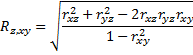
Here x and y are viewed as the independent variables and Z is the dependent variable.
If we find the Correlation between two variables, we can eliminate one of the variables
Project
First, I analyzed the data of three different sheets and tried to merge the three data into one so that it was easy to interpret, I sorted for “FIPDS” or “FIPS” since I considered as the primary key
After I merged those data, I tried to analyze the data and tried to form a relationship between inactivity and diabetes
Plotting the graph for these two where diabetes in the x-axis (Independent variable) and inactivity in the y-axis (Dependent variable)
After this, I tried to calculate the Mean, median, mode, variance, and Standard deviation for the above
For the next step, I’ll try to calculate the relation for all three variables and plot and analyze the graph